An effective lower thirds animation keeps text inside the title-safe area, gives it a dedicated backing for contrast, animates on in under a second, and holds long enough for the viewer to actually read it. Get those four things right and almost any style works. Follow the workflow below, or jump straight to a tested template if you need to move fast.
TL;DR:
- Budget roughly 0.33 seconds of hold time per word, plus a buffer, and base the duration on your longest expected name or title.
- Choose MOGRTs for Premiere Pro, native After Effects projects for full compositing control, or built in editor titles for quick, less portable work.
- Vertical and square edits may lose the bottom 10% to 20% to captions and app controls, so test placements on device screenshots.
- Lock position, animation timing, and in and out points; expose only text, alignment, and accent color, then test maximum length names against busy footage.
- Build a reusable master template for a recurring show; for a single project, using a production platform can avoid setup you may not reuse.
Table of Contents
- What lower thirds are and when to use them
- Design and legibility rules: safe areas, contrast, and type
- Animation timing and motion patterns that keep text readable
- Templates, file formats, and packaging for editors
- Adapting lower thirds for different aspect ratios and platforms
- Step-by-step workflow: from design comp to applying a template
- How Brix36 can speed up motion asset production
- Prioritize repeatability over one-off polish
- Brix36: a fast option when you need motion assets without the setup
- FAQ
- Sources
What lower thirds are and when to use them
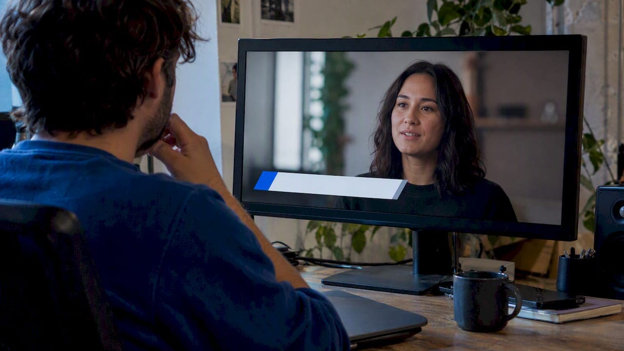
A lower third is a graphic placed in the bottom portion of the frame that identifies a speaker, location, or topic without covering the main action. The format spans interviews, documentaries, news broadcasts, tutorials, and social clips, but the job stays the same: give context fast, then get out of the way.
Different formats call for different weights and timing:
- Broadcast news lower thirds tend to be dense, with a name, title, and sometimes a ticker, built for repeated reuse across a show.
- Interview and documentary lower thirds are usually simpler, showing a name and one line of context, held long enough to read comfortably.
- Tutorial lower thirds often label steps or tools, appearing briefly and repeatedly as the content moves.
- Social and short-form lower thirds skew minimal because screen space and attention are both limited.
The use case should drive scale, motion style, and hold time before you touch a single keyframe. A dense broadcast graphic animated like a quick social caption will feel rushed, and a minimal social tag held like a news chyron will feel sluggish.
Design and legibility rules: safe areas, contrast, and type
Text that gets cropped or lost in the background undermines the whole graphic, so start with the frame itself. Title-safe is commonly defined as the central 90% of the frame, with action-safe slightly larger; at 1920x1080 that title-safe guidance approximates a 96-pixel inset from each edge.

A 96-pixel inset at 1080p keeps your text clear of overscan and UI overlays on most displays. That margin matters more than it looks: a name that sits even a few pixels past it can clip on certain TVs or get hidden behind platform captions.
Beyond safe margins, a few rules keep text readable:
- Give every lower third its own backing, whether a solid panel, a gradient, or a drop shadow, since text floating directly on busy footage disappears fast.
- Keep stroke and line widths thick enough to avoid flicker on interlaced or compressed output.
- Set a wrap or auto-shrink rule for long names so a 20-character title does not break your layout.
- Lock position, timing, and animation in the template, and expose only the fields an editor should actually touch, like text, alignment, and an accent color.
That last point is what separates a reusable template from a one-off graphic. The backing and template guidance from practitioner workflows recommends locking everything except the handful of fields editors need, specifically to prevent style drift across episodes.
Animation timing and motion patterns that keep text readable
Timing is where most lower thirds fail, not design. A graphic that looks great as a still frame can feel jarring or unreadable in motion if the pacing is off.
- Animate on fast: 0.33 to 1 second is enough for a panel wipe, slide, or fade to register without feeling sluggish.
- Hold for reading time: budget roughly 0.33 seconds per word plus a buffer, so a four-word name and title needs well over a second of hold before it animates off.
- Animate off at the same speed or faster than the entrance, so the exit never outlasts its welcome.
Durable motion patterns include a panel wipe paired with a text slide, a simple mask reveal, or a clean fade. These read well across broadcast and social because they are fast to parse and do not call attention to themselves.
Animate lines or words together rather than letter by letter. Per-letter typing effects look novel once and become distracting on repeat views, and they delay the moment the name is actually legible, a point practitioner guidance on broadcast graphics makes directly.
Use gentle ease curves on entrance and exit, and never move or reflow elements during the hold. A name that shifts position mid-hold reads as a glitch, not a design choice.
Pro Tip: Build your hold duration from the actual word count of your longest expected name or title, not from a fixed default.
Templates, file formats, and packaging for editors
The format you build in determines how far a lower third can travel across projects and teams. Three formats cover most editing workflows: Motion Graphics Templates (MOGRTs) for Premiere Pro, native After Effects projects for teams that composite directly, and generator titles built inside the editor itself for lightweight needs.
Each has a different compatibility profile. MOGRTs drop into Premiere with no plugins and expose controllable fields through a simple panel. Native After Effects projects give full control but require the editor to open or render through After Effects. In-editor generator titles are the fastest to apply but the least portable between teams.
Whichever format you choose, the packaging rules stay the same:
- Expose text, alignment, and a small set of color accents.
- Lock position, in and out points, and animation timing so nobody accidentally breaks the reading-time math.
- Keep one master template per show or brand, version it, and document which fonts it depends on.
- Test the packaged template with placeholder text at maximum expected length before handing it off.
A template that passes those checks will survive handoffs between editors without constant rebuilding.
Adapting lower thirds for different aspect ratios and platforms
A lower third built for 16:9 rarely survives an unmodified crop to 9:16 or 1:1. Vertical and square formats often reserve the bottom 10 to 20% of the frame for platform UI and burned-in captions, which pushes the practical safe zone for a lower third toward the upper-middle of the frame.
The practical fix is to design a shared safe core, the smallest region that stays visible across every crop you need, then nest wider zones around it for 16:9, 1:1, and 9:16 separately. A lower third that lives inside that shared core needs little rework between formats.
A few placement habits help:
- Reserve a caption band at the very bottom and keep lower thirds above it, never overlapping.
- For vertical video, shift the lower third toward the upper third or side of the frame rather than the true bottom.
- Test every adapted version on actual device screenshots, not just a desktop preview, since mobile UI chrome covers different amounts of screen depending on the app.
Treating the caption band as part of the graphics package from the start, rather than an afterthought, avoids most of the collisions that make social cuts look unfinished.
Step-by-step workflow: from design comp to applying a template
Here is a compact path from a blank comp to a template ready for daily use in an edit.
- Set up your comp with safe-zone guides at 90% title-safe and your platform's caption band marked.
- Build the animation using a durable pattern (panel wipe, mask reveal, or fade) with on, hold, and off timing matched to your longest expected text.
- Expose the fields editors need: text, alignment, and an accent color, nothing more.
- Package fonts and lock the version so the template renders identically on every machine that opens it.
- Test on worst-case footage: busy backgrounds, long names, and the smallest screen you expect viewers to use.
- Export as a MOGRT, After Effects project, or in-editor generator, matching the format your team actually uses.
In Premiere Pro, MOGRTs let editors adjust exposed fields in the Essential Graphics panel without opening After Effects. In After Effects, keep the master comp separate from render comps so updates propagate cleanly. Across either tool, run a final checklist before render: confirm text stays inside the safe area, confirm backing contrast holds against the actual footage behind it, confirm hold time matches word count, and confirm nothing collides with burned-in captions.
How Brix36 can speed up motion asset production
Building a master template from scratch takes time most editors do not have on a tight deadline. For creators who need a motion asset quickly rather than building one in-house, some platforms offer one-tap looks and AI-powered automation for video, music video, and film production, often paired with a pay-as-you-go credits model instead of subscriptions.
That combination fits a specific moment: when you need a polished result fast and do not want to invest hours building and testing a reusable template for a one-time project. If you produce the same show or series weekly, an in-house master template still pays off over time. If you are producing one branded video, a short film or an AI lip sync music video, reaching for a platform-assisted workflow can get you to a finished result without building infrastructure you will only use once.
Prioritize repeatability over one-off polish
The lower thirds that hold up over a season of production are not the fanciest ones. They are the templates that survive a long name, a busy background, and a tired editor at 11 PM without breaking.
My standing advice: build one master template, lock down everything except the fields that must change, and test it against your worst footage before you trust it on your best. A graphic that only works on your demo reel is not a system, it is luck.
— simeon
Brix36: a fast option when you need motion assets without the setup
When a project needs polished motion graphics and you do not have days to build and test a template system, we offer a route that skips the setup entirely. Our platform pairs one-tap looks with AI-powered production tools so you can move from an idea to a finished video, music video, or short film without a technical production team.

Because some platforms run on pay-as-you-go credits rather than subscriptions, you spend only on the projects you actually produce. This payment style can be practical for freelancers and small studios handling occasional branded content, music videos, or short films rather than a weekly broadcast schedule.
| Need | Approach that fits |
|---|---|
| One-off branded video or short film | Short film tools with one-tap looks |
| Music video with synced visuals | AI lip sync music videos |
| Consistent artist look across releases | Artist DNA profile |
| Pay only for what you produce | Credits |
Explore our films and music video tools or check current credit options to start your next project.
FAQ
What is a lower thirds animation used for?
A lower thirds animation identifies a speaker, location, or topic by displaying text in the lower portion of the frame without blocking the main footage. It is used in interviews, broadcasts, tutorials, and social video to give viewers context quickly.
How long should a lower third stay on screen?
A common rule of thumb budgets about 0.33 seconds of hold per word plus a short buffer for notice time, so a short name and title typically needs more than a second before it animates off. Longer titles need proportionally more hold time.
What is the title-safe area for lower thirds?
Title-safe is commonly defined as the central 90% of the frame, which at 1920x1080 approximates a 96-pixel inset from each edge. Keeping text inside that margin avoids cropping on different displays and overlay elements.
Can I use the same lower third for vertical and horizontal video?
Not without adaptation. Vertical formats often reserve the bottom 10 to 20% of the frame for captions and platform UI, so designing a shared safe core and nesting different zones for each aspect ratio keeps one animation usable across crops.
What file format should I use for a lower thirds template?
The right format depends on your editing tool: Motion Graphics Templates (MOGRTs) work directly in Premiere Pro, native After Effects projects suit teams compositing in that tool, and in-editor generator titles work for lightweight, single-project needs.
Sources
- North America Broadcast Specifications and Requirements
- Broadcast graphics and lower thirds: what actually works | MediaScaleUp