Kinetic typography is text that moves over time to carry an idea or an emotion. The words are the script, and the motion is the performance: timing, scale, speed and direction tell the viewer what to feel and where to look. You can build it by hand with keyframes, or generate scenes with AI and then tune the timing. This guide covers both, from fonts and pacing to 3D text, Instagram Reels and where AI tools help.
TL;DR
- Kinetic typography is animated text, also called motion typography or moving text. It works best when each motion has a job: emphasis, rhythm or emotion.
- Start from clean audio or a tight script, mark the beats, then animate in layers: background, supporting text, primary text.
- Pick bold, geometric sans-serif fonts and keep each line readable for at least half a second after it settles.
- For Reels, build around one message, keep text clear of faces and interface overlays, and check it at phone size, with and without sound.
- AI can draft scenes and looks quickly. You still decide the hierarchy, the timing and what gets cut.
Table of Contents
- What kinetic typography is and why it works
- The two main styles: which one fits your project
- Fonts and design choices that stay readable
- How to make a kinetic typography video, step by step
- 3D text animation: when depth helps
- Animated text for Instagram Reels, and transitions that suit it
- Kinetic typography with AI: what helps and what still needs you
- Make your own animated text with Brix36
- A quick checklist before you publish
- FAQ
- Sources
What kinetic typography is and why it works
At its simplest, kinetic typography is animated text presented over time to convey or evoke an idea. Researchers at Carnegie Mellon, who have studied the format since the 1990s, describe time-based text presentation as a way to capture and steer viewer attention, and in some cases to improve reading performance.
The reason it feels so different from a static caption is that it borrows from film. A 2002 paper on a kinetic typography engine frames it as a medium that brings the expressive power of film, such as emotion, character and visual attention, to text. A word that slams in, a phrase that drifts, a line that shakes: each carries tone that plain letters cannot.
That power has a cost. Research on affective messages built from dynamic text warns that kinetic text can demand too much attention from readers, and suggests avoiding sudden onsets when you do not want to grab attention. Motion is a spotlight. Use it on the words that deserve it.
Where you see it
The common uses are easy to spot once you look for them:
- Lyric videos, where words land on the beat and the chorus gets the biggest treatment.
- Explainers and ads, where a single phrase animates in sync with a voiceover.
- Title sequences and openers, where the type sets the mood before any image appears.
- Social clips, where animated captions keep viewers watching with the sound off.
- Brand motion, such as animated slogans and logo reveals.
If lyric videos are your main interest, our step-by-step lyric video tutorial walks through getting the lyrics in place before you animate anything.
The two main styles: which one fits your project
Most kinetic type falls into two approaches, and choosing between them early saves hours.
Type-driven animation. The text is the whole picture. Words fill the frame, change scale, rotate and stack. It suits speeches, poems, lyrics and punchy statements. Because nothing competes with the words, hierarchy and timing do all the work.
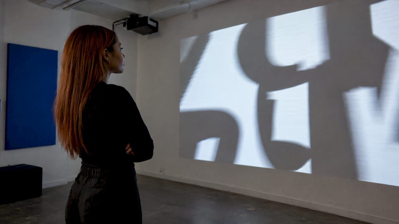
Type-in-scene animation. The text sits on or inside footage, illustration or a 3D space. Think of a headline sliding behind a subject, or a lyric painted onto a wall. It suits ads, music videos and short films, where the text should feel part of the world.
A useful test: if you removed the visuals, would the message still land? If yes, go type-driven. If the words only make sense with the image, go type-in-scene and plan the layout around where the subject sits.

Fonts and design choices that stay readable
Motion makes letters harder to read, so the font has to compensate. Guidance from a motion design agency says legible animated text avoids thin scripts and overly decorative faces, favoring bold slab or geometric sans-serif fonts, and uses scale and color to build hierarchy.
Practical rules that follow:
- Choose weight over flair. A heavy geometric sans survives small screens, compression and fast movement. Save delicate or decorative faces for slow, deliberate moments, such as a closing line.
- Use at most two typefaces. One for the main message, one for support. Vary size, weight and color instead of adding fonts.
- Build hierarchy with scale. The most important word should be the largest or the brightest. If everything is big, nothing is.
- Hold the text. The same agency guidance gives a rule of thumb: text should stay readable for at least 0.5 seconds after it settles. Longer lines need longer holds.
- Limit excess motion. The same guidance notes that heavy motion can cause vestibular discomfort in some viewers. Avoid constant spinning, shaking and full-screen zooms, and give the eye resting moments.
- Contrast first. Light text on a dark or blurred background, or dark text on a clean field, beats a clever palette that fades into the image.
How to make a kinetic typography video, step by step
The workflow is the same whether you animate in desktop motion software or in a browser or app.
1. Write and tighten the text
Keep the piece concise and check spelling and grammar carefully before animating. Film school guidance on kinetic type from NYFA makes both points, and fixing a typo after 40 animated layers is painful. Cut anything the viewer could do without. Short lines animate better than paragraphs.
2. Prepare the audio
If your piece rides on speech or a song, start with clean audio. NYFA advises choosing relatively clean dialogue without overlapping speakers or competing music, then improving intelligibility with editing, equalization and reduced ambient noise before you animate. Muddy audio makes it impossible to judge whether the text hits land.
3. Mark the beats
Import the audio first and listen all the way through. A motion design training tutorial recommends placing markers at the words, sounds or beats that should drive the animation, and using the audio waveform as a visual timing reference. Those markers become your plan: a word-level or beat-level map you can build detailed motion on.
For music, think in bars rather than seconds. Our guide to planning a music video storyboard by bar applies directly to lyric and typographic pieces.
4. Set the hierarchy and storyboard
Decide which words are primary, which are supporting and which are background. Then sketch the key moments: the opening, the turn, the peak, the close. A rough storyboard of five to ten frames is enough to catch problems, like a line that has nowhere to sit.
5. Animate in layers
Build complex motion in layers, starting with background elements, then supporting text and finally the primary text. This is the approach the motion agency guide recommends, and it keeps the main message from fighting with decoration. Within each layer, set timing first, then add easing so movement accelerates and settles naturally instead of sliding at a flat speed.
6. Sync, review and export
Align the key text hits with the voiceover or music, then watch the piece at normal size on the device your audience will use. Export at high settings so the type stays crisp after delivery, as NYFA recommends.
3D text animation: when depth helps
Three-dimensional text gives type a camera move, a shadow and a sense of place. It earns its place in title sequences, product reveals, music video openers and any scene where the words are an object in the world rather than a caption on top of it.
The basic recipe is the same across most software: convert or create the text as a 3D object or layer, add a camera and a light, then animate position and rotation so the viewer perceives depth. A few habits keep it from looking dated:
- Move the camera, not just the text. A slow push or orbit looks richer than letters spinning in place.
- Keep extrusion modest. Thick extruded letters hurt readability at small sizes.
- Light for contrast. A single strong light with soft shadows reads better than many competing ones.
- Stay in the same style. A glossy 3D title over flat 2D captions looks like two different videos.
- Save 3D for the hero line. One dimensional moment per scene is plenty.
If you would rather describe the scene than build the geometry, Brix36 lets you generate motion graphics and title looks from a prompt and refine them; more on that below.
Animated text for Instagram Reels, and transitions that suit it
Reels are the most common home for animated text today, and the constraints are specific: vertical frame, small screen, interface overlays and many viewers watching without sound.
Build each Reel around one message. Then:
- Reveal by phrase or word, or move a whole title as one unit. Both read well on a phone.
- Keep text clear of faces, products and interface overlays. Captions, buttons and the account name cover parts of the frame, so leave the top and bottom margins free.
- Review at phone size, with and without sound. If the message only works with sound, add on-screen text; if it only works silent, check that the audio still adds something.
- Keyframe the basics. Position, scale and rotation cover most needs. A creator-focused guide to Reels text animation covers these same basics.
Our vertical video editing workflow goes deeper on safe zones and 9:16 framing. The same discipline shows up in broadcast graphics: our piece on lower thirds with a 96px safe space is a good model for keeping text out of trouble zones.
Transition ideas that pair well with text
Good transitions use the text itself as the cut. A few that work without heavy effects:
- Word wipe. A large word slides across the frame and its edge reveals the next shot.
- Scale-through. The text grows until a letter fills the screen, then the next scene appears inside that letter.
- Beat cut. The new shot starts exactly on the hit of a word, with a brief hold on the text.
- Mask reveal. Text acts as a window onto a different clip, then expands to fill the frame.
- Slide-behind. A headline passes behind the subject, then returns, so type and footage feel layered.
Use one transition idea per Reel and repeat it. Variety for its own sake looks restless.
Kinetic typography with AI: what helps and what still needs you
AI tools now handle several slow parts of the job. They can turn a script into scenes, suggest looks, generate backgrounds and 3D-style title treatments from a description, and match text timing to a song or voiceover. If you are weighing options, the workflow in our guide to text to video animation, from script to moving scenes shows how a script becomes a sequence. Another take on turning text into video shows how the same idea applies to social content for small businesses.
What AI does well:
- Speed on first drafts. You get a visual direction in minutes instead of building from a blank timeline.
- Consistent looks. One style can be applied across many scenes.
- Lower skill barrier. You describe what you want instead of setting keyframes.
What still needs a human eye:
- Spelling and line breaks. Always read generated text frame by frame before you publish.
- Hierarchy. A tool does not know which word is the punchline. You do.
- Timing against audio. Check that the key words land on the beat and that each line holds long enough to read.
- Taste. Cut anything that moves without a reason.
Treat AI output as a strong first pass, then apply the same checklist you would use on hand-built motion.
What we think about moving text
We built Brix36 for people who have strong ideas and no time to learn a full motion design toolchain. Kinetic typography is a good example: the craft is mostly decisions about timing, hierarchy and mood, and those are creative decisions, not technical ones.
That is why we focus on one-tap looks and section-based storyboarding. You plan the piece by section, such as verse, chorus and drop, and choose a look that fits each one, instead of wrestling with layers before you know what the video should feel like. Our AI handles the heavy lifting so you can spend your attention on the message.
We also believe you should pay for what you make. Brix36 runs on pay-as-you-go credits rather than a subscription, so a lyric clip this week and nothing next month costs you exactly what you used.
simeon
Make your own animated text with Brix36
If you want to go from a line or a lyric to finished motion without learning keyframes, try Brix36 Create for motion. You choose a look, build your piece section by section and refine the result. For music, our AI lip sync music videos follow your lyrics, and Artist DNA helps keep your visual identity consistent across clips. Brix36 uses prepaid credits rather than a subscription, and you can see how they work on the credits page.

Brand teams can apply the same motion approach to logos; see how in our AI logo animation in four moves.
A quick checklist before you publish
- Does every moving element have a job: emphasis, rhythm or emotion?
- Is the most important word also the most visible?
- Does each line stay on screen long enough to read, at least half a second after it settles?
- Is the font bold enough to survive phone screens and compression?
- Is anything covered by faces, products or platform overlays?
- Does the piece work on mute, and does it still sound right with audio?
- Have you read every word for typos at full size?
FAQ
What is kinetic typography?
It is animated text: words and letters that move, change size or shift position over time to express an idea or emotion. It is also called motion typography or moving text. It is used in lyric videos, ads, explainers, titles and social clips.
Is kinetic typography still relevant?
Yes. Short-form video, lyric videos and silent autoplay feeds all rely on text that carries the message by itself. The technique has been studied since at least the 1990s, and the core ideas of timing, hierarchy and readability still apply.
What fonts are best for kinetic typography?
Bold slab or geometric sans-serif fonts hold up best, because they stay legible while moving and on small screens. Avoid thin scripts and highly decorative faces for fast motion. Use scale and color for hierarchy, and keep each line readable for at least 0.5 seconds.
How long should each word or line stay on screen?
As a rule of thumb, text should remain readable for at least 0.5 seconds after it finishes moving. Longer lines need more time, and a line that carries the main message deserves a deliberate hold. Test by watching at phone size without sound.
Can AI make kinetic typography for me?
AI tools can draft scenes, looks and motion from a script or lyric quickly. You should still review spelling, decide the hierarchy and check that key words land on the beat before you publish.
Sources
- Kinetic Typography, Carnegie Mellon research page
- The kinetic typography engine, ACM Proceedings
- The Kinedit System: Affective Messages Using Dynamic Texts
- Kinetic Typography: The Complete Guide to Motion Text
- How to Make a (Good) Kinetic Typography Animation Video, NYFA
- Tutorial: Kinetic Typography, Part 1
- Instagram Reels text animations
- How to turn text into video